1050 Brands 3173 Models 21456 Galleries 13419 Typefaces 6273 Patents
Home » Royal » Citadel » 1963 #CT 5418715
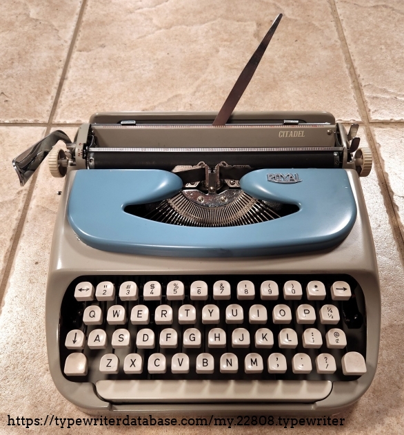
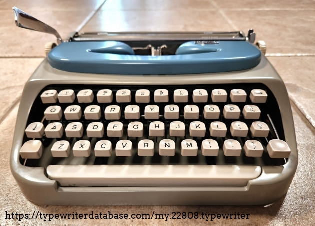
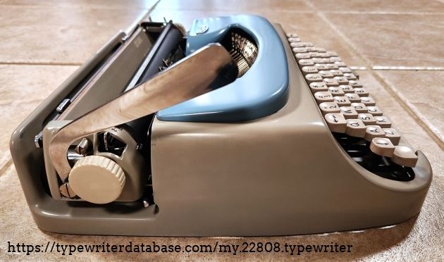
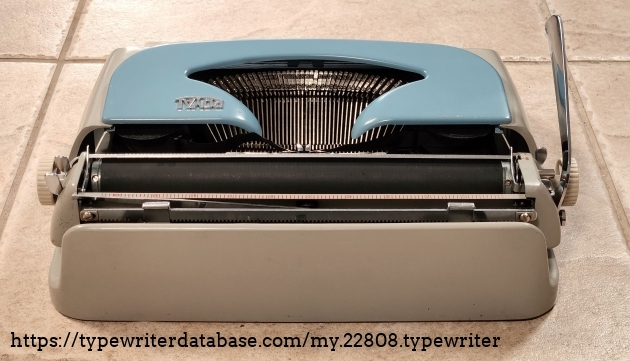
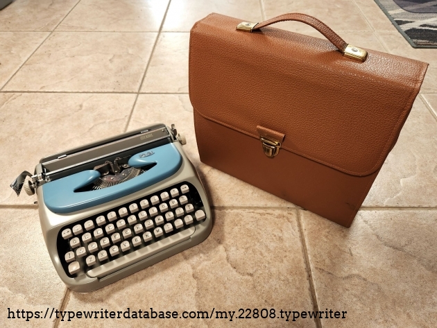
1963 Royal Citadel Serial # CT 5418715 1963 Royal Citadel typewriter, Serial # CT 5418715 Wayne Bouchard's 1963 Royal Citadel typewriter. 2024-05-12 From the Virtual Typewriter Collection of Wayne Bouchard: 1963 Royal Citadel Serial # CT 5418715 Presenting the Royal Citadel typewriter, made in Royal's Holland facility. This is an "ultra-portable" (or a slim portable, as I like to term them). It is a very light and very handy typewriter. In keeping with the other such units of this class, it lacks some features that are found on larger units, such as the bi-chrome setting, the paper guide, touch control, and tab system, along with somewhat simplified mechanics. Nevertheless, it is a good little unit and perfectly functional. However, mechanically, it is a departure from the earlier royals in that it has no quick release for the platen and, in fact, getting it out is quite a pain and causes other parts to fall loose that do not on other Royal typewriters. This, I find, to be very annoying as it makes it hard to clean and service. Unusually for the era, it is also a carriage shift unit, though that was more common among these lighter weight portables because it required less room in the case and the mechanism was also a tad simpler.

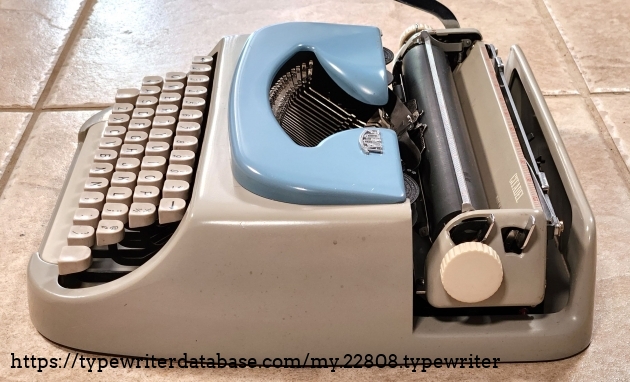
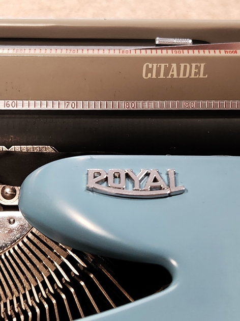
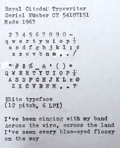
This particular typewriter is primarily a darker grey with what is termed a "pottery blue" ribbon cover. The "Citadel" typewriter was one of several such portables made about the same time by Royal. As best as I can determine, the primary difference was the color of the units, slightly different styling, different levels of maintainability (removable bottom plates, etc), and whether or not they had a bi-chrome. It seems like Royal decided in 1962 to introduce a whole slew of "fashionable" portables that would be styled a little bit differently depending on their configuration and each configuration would be given a different name, such as "Lark", "Jupiter", "Traveler", or "Cruiser", for example. My typewriter is equipped with Elite typeface, however due to scant documentation of Royal typeface, I can't determine if there is a specific designation for this since I can't correlate the marks on the type slugs to anything.

In some circles, this series of typewriters gained something of a bad reputation. In part, this was because of perceived reliability issues. It is possible that this was the case, but the differences in the mechanics from the earlier series probably played somewhat into that. I suspect when they did have problems, that the service techs had some difficulties reconciling the differences from earlier units and had trouble working on these. I also suspect that it was because of the character of this unit. I have noticed in my use that this requires a firmer touch than other units do if you are to get a good impressions and my platen is not overly hard, so it's doing its job properly. So if you type softly and do not type with a good rhythm, you're not going to have a good experience.

This specific unit caught my attention both because of the color combination and general shape, but also because of the "satchel" carrying case with the slide lock flap. I thought that was a very interesting carrying case and couldn't resist it. The only things lacking are something like a paper and pen pockets on the outside and a shoulder strap.

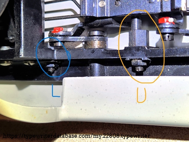
I mentioned that this unit was a departure, mechanically, from other Royals. That shows up dramatically in the one adjustment I had to do to this unit when I got it and that was the "on feet" adjustment (aligning upper and lower case printing). Rather than the usual adjustment screws with locking nuts where the end of the screw directly acted as the limiter, this design uses a stud offset on the face of a large nut to create an eccentric adjustment. After loosening the lock nut, his is controlled either grossly by turning the large nut directly to position the stud, or finely by means of an adjusting screw with a very, very narrow slot that's small enough that I didn't have a screw driver that would fit it easily. So that makes the adjustment process more sensitive since a little goes a *very* long way. It also makes it hard to get it in balance between the two sides of the carriage.

So, overall, this is a nice little typewriter and will absolutely do plenty of work for you, but your service tech isn't necessarily going to love you for bringing it in.

1963 Royal Citadel #CT 5418715

Status: My Collection
Hunter: Wayne Bouchard (azweb100)
Created: 04-27-2024 at 02:55AM
Last Edit: 05-12-2024 at 10:40PM

Description:

Presenting the Royal Citadel typewriter, made in Royal's Holland facility. This is an "ultra-portable" (or a slim portable, as I like to term them). It is a very light and very handy typewriter. In keeping with the other such units of this class, it lacks some features that are found on larger units, such as the bi-chrome setting, the paper guide, touch control, and tab system, along with somewhat simplified mechanics. Nevertheless, it is a good little unit and perfectly functional. However, mechanically, it is a departure from the earlier royals in that it has no quick release for the platen and, in fact, getting it out is quite a pain and causes other parts to fall loose that do not on other Royal typewriters. This, I find, to be very annoying as it makes it hard to clean and service. Unusually for the era, it is also a carriage shift unit, though that was more common among these lighter weight portables because it required less room in the case and the mechanism was also a tad simpler.

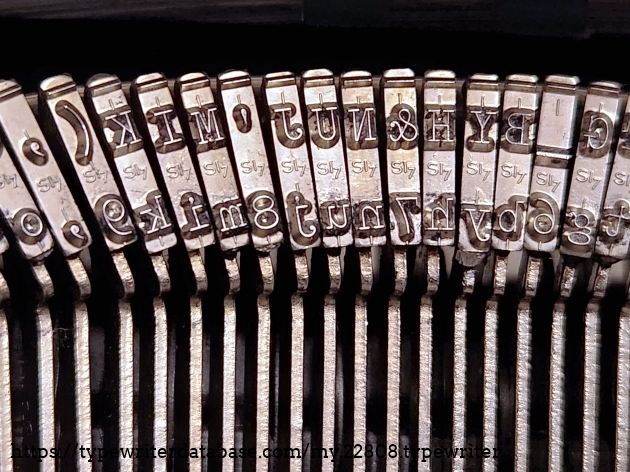
This particular typewriter is primarily a darker grey with what is termed a "pottery blue" ribbon cover. The "Citadel" typewriter was one of several such portables made about the same time by Royal. As best as I can determine, the primary difference was the color of the units, slightly different styling, different levels of maintainability (removable bottom plates, etc), and whether or not they had a bi-chrome. It seems like Royal decided in 1962 to introduce a whole slew of "fashionable" portables that would be styled a little bit differently depending on their configuration and each configuration would be given a different name, such as "Lark", "Jupiter", "Traveler", or "Cruiser", for example. My typewriter is equipped with Elite typeface, however due to scant documentation of Royal typeface, I can't determine if there is a specific designation for this since I can't correlate the marks on the type slugs to anything.

In some circles, this series of typewriters gained something of a bad reputation. In part, this was because of perceived reliability issues. It is possible that this was the case, but the differences in the mechanics from the earlier series probably played somewhat into that. I suspect when they did have problems, that the service techs had some difficulties reconciling the differences from earlier units and had trouble working on these. I also suspect that it was because of the character of this unit. I have noticed in my use that this requires a firmer touch than other units do if you are to get a good impressions and my platen is not overly hard, so it's doing its job properly. So if you type softly and do not type with a good rhythm, you're not going to have a good experience.

This specific unit caught my attention both because of the color combination and general shape, but also because of the "satchel" carrying case with the slide lock flap. I thought that was a very interesting carrying case and couldn't resist it. The only things lacking are something like a paper and pen pockets on the outside and a shoulder strap.

I mentioned that this unit was a departure, mechanically, from other Royals. That shows up dramatically in the one adjustment I had to do to this unit when I got it and that was the "on feet" adjustment (aligning upper and lower case printing). Rather than the usual adjustment screws with locking nuts where the end of the screw directly acted as the limiter, this design uses a stud offset on the face of a large nut to create an eccentric adjustment. After loosening the lock nut, his is controlled either grossly by turning the large nut directly to position the stud, or finely by means of an adjusting screw with a very, very narrow slot that's small enough that I didn't have a screw driver that would fit it easily. So that makes the adjustment process more sensitive since a little goes a *very* long way. It also makes it hard to get it in balance between the two sides of the carriage.

So, overall, this is a nice little typewriter and will absolutely do plenty of work for you, but your service tech isn't necessarily going to love you for bringing it in.

Typeface Specimen:
Photos:

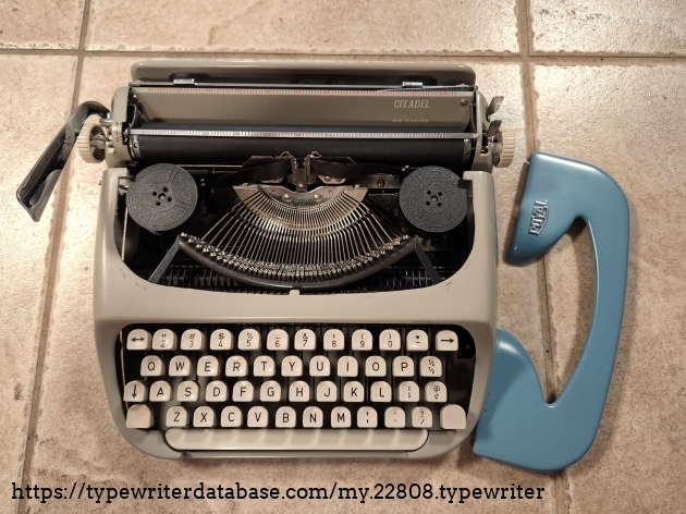
Unlike some, this one DOES come with a paper stand, which can fold to either side for storage.


The ribbon cover lifts off from the front and two tabs on the rear slide under the tabs on the frame, near the backs of the ribbon spools.

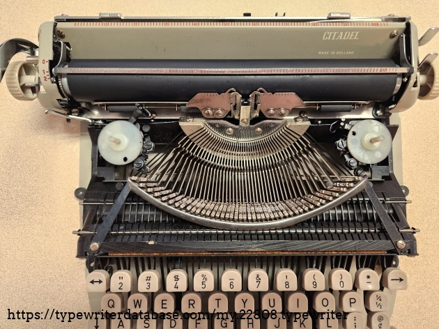
A view of the typewriter out of its shell

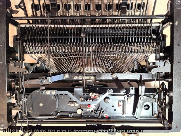
Thought a view of the mechanism would be useful to some. This is normally hidden by the flat bottom cover plate.

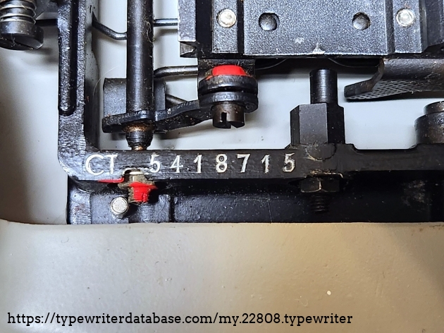
Serial number CT 5418715.
Located on the left side, below the carriage.
Serial number CT 5418715. Located on the left side, below the carriage.

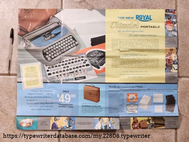
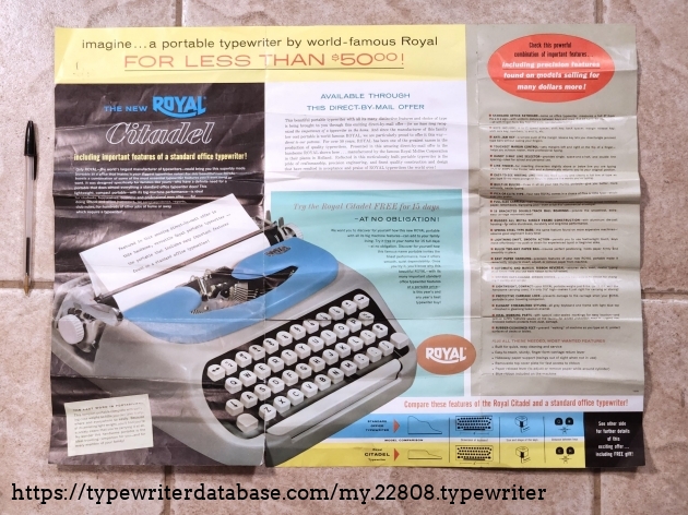
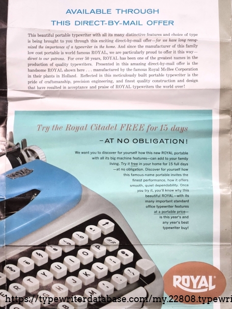
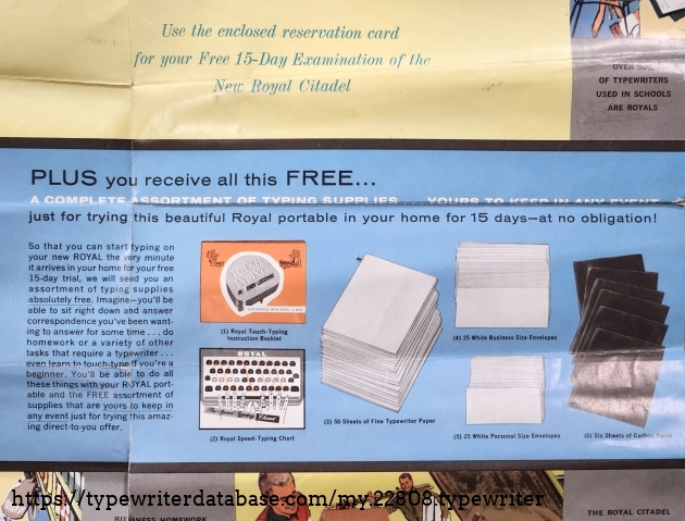
The original manufacture's literature on this unit. Note the ball point pen on the left used to give scale.


Goodies to incentivize you to buy the unit after the free demo.


Here's the upper and lower case adjustments I mentioned. You can clearly see the positioning stud inside the yellow circle. The rear of the machine is to the right on this photo and the screws are not accessible without taking the cover off. (But you don't have to remove the bottom place.)

This is elite typeface, but I couldn't tell you what "S17" means, if anything.

Hunter: Wayne Bouchard (azweb100)

Wayne Bouchard's Typewriter Galleries [ My Collection ] [ My Sightings ]
Status: Typewriter Hunter
Points: 1089

Collector of several things, including typewriters, slide rules, and mechanical calculators.
Started collecting typewriters in 2023 with a Royal HHE like the one I did my first book report on when I was in school and using my dad's old typewriter.


RESEARCH NOTE: When researching the Royal Citadel on a computer with lots of screen real estate, you may find that launching the Royal Serial Number page and the Royal Citadel By Model/Year/Serial page in new browser windows can give you interesting perspectives on changes throughout the model series.