
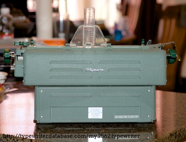
1961 Olympia SG1 #7-670135
Status: My Collection
Hunter: Dan Johnson (rdj)
Created: 06-06-2014 at 09:45AM
Last Edit: 06-11-2015 at 09:35PM

Description:
Mark Peterson created a gallery for his SG1, so that seemed a good reason to put up mine.
Although Mark has a point about the paper bail having a fairly "cheap" construction. this remains a solidly-built machine, and it shares with the SM3 similar qualities of comfortable typing. Some features such as the "automatic" paper loader (and unloader) and a few of its typographic idiosyncrasies do make this machine seem compelling to me.
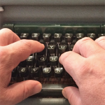
One of the pleasant activities associated with new typewriter acquisition is figuring out the intent behind the design of its keyboard, particularly the presence and absence of particular symbols. Typewriter keyboard design is in some ways similar to modern user interface (or "user experience", "UX") design and in other ways completely different.
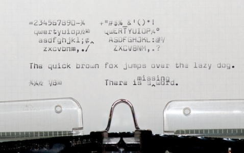
On this SG1, for example, one finds several unusual keys. First, we have "th" which is useful for such abbreviations as "8th" or "17th" or "40th". Why did they include that one but omit "st", "nd", and "rd"? Wouldn't one sometimes want to write "1st Prize" or "42nd Street"? What makes "th" so special?
Perhaps the reason bas to do with another unusual key: "1/". There are also "", "1/2" and "3/4" keys, all commonly used fourths. It makes sense to include a "1/" key to facilitate typing other common ratios such as "1/8", "1/16", "1/32", "1/64", and so on. (These fractions are commonly used in imperial length measurements.)
It happens that "th" may be used with the majority of these common ratios: "1/4th", "3/4th", "1/8th", "1/16th", and "1/64th". You would need to use separate letter keys to get "1/3rd" and "1/32nd", but if you had just one, "th" would be a reasonable choice. And so, it was.
Now, what about this "double character spacing" feature? That's the key with a single tick mark (') above a double tick (''). Engaging double-spacing causes an extra space to appear between each successively-typed character. Why bother with this? Under what conditions would one consider typing character-space-character-space-...?
There is such a circumstance, and absent this double-spacing feature, it can be a pain to get right. We are accustomed these days to our word processors creating tables of contents for us that we sometimes forget those used to be constructed by hand:
Chapter 1. Much Ado About Nothing . . . . . . . . . . . . . . . . . . . . . 3
Chapter 2. Something on the Horizon . . . . . . . . . . . . . . . . . . . . 10
Chapter 3. Enough with These Dots! . . . . . . . . . . . . . . . . . . . . . 24
Not only do you need to align the dots with the line above, but you need to reliably alternate pressing "." and the space bar. That can be tedious and boring, and you're more likely than not to make a mistake for which an erasure would make the whole page look bad.
Caret (^)? Word insertion. Most easily used when typing with 1-1/2 line spacing which gives you just enough space to squeeze a few words in between previously-typed lines. Brilliant!
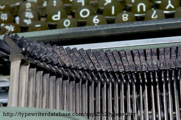
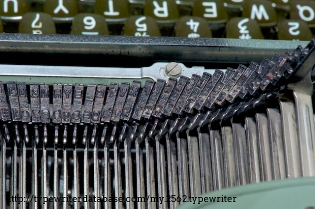
Although I have done preliminary cleaning and repair of someone's mis-gudied attempt to adjust the card holders, there remain a few problems. The carriage has a rough spot near its center of travel (with which I can live), the typeslugs are not hitting the ribbon squarely, and both the spacebar and ribbon advance are a bit flaky. The ribbon advance issue seems worse when the lid is seated in its correct position, so there are adjustments to be made. (You can see the intentional gap beneath the lid in some of the gallery pictures.)
I am paying much attention to the accuracy and reliability of ribbon advance on these machines, because I am beginning to use carbon-film 1/2" ribbons due to the consistently crisp impression that they make on paper. You definitely notice when things are not quite right with these ribbons!
Typeface Specimen:
Links:
Photos:
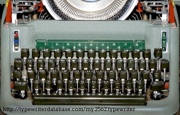


 controls double-spacing (horizontal) mode which presumably exists for ornamentation such as spacing dots in a table of contents or figures. The up-arrow is an insertion mark, and the \"1/\" allows typing commonly-used ratios in addition to the provided ones.")

 (Okay, that was a few decades ago, but still...)")

Hunter: Dan Johnson (rdj)
Dan Johnson's Typewriter Galleries [ My Collection ] [ My Sightings ]
Status: Typewriter Hunter
Points: 948
I have always loved typewriters along with other kinds of well-engineered tools and devices such as slide rules, calculators (particular HP), radios, cameras (particularly Nikons), and microscopes. In addition to appreciating their intrinsic beauty and utility, they represent "things that need to be figured out to be understood". That's how I first learned about computers and programming in the 1970s, by figuring things out for myself. It's activity in which I never seem to tire of engaging.
Although communities have arisen around other collection interests, typewriters have the advantage that those who use them also typically enjoy communicating through words, whether those words are about the machines themselves or their lives, hopes, dreams, or expressions of beauty. There's much to be appreciated here.
RESEARCH NOTE: When researching the Olympia SG1 on a computer with lots of screen real estate, you may find that launching the Olympia Serial Number page and the Olympia SG1 By Model/Year/Serial page in new browser windows can give you interesting perspectives on changes throughout the model series.